Cerebral Palsy Association of British Columbia
Project: Website
Role: Web Developer
Client: Cerebral Palsy Association of BC
Year: 2018
CMS: WordPress
Site: bccerebralpalsy.com
Giving individuals with cerebral palsy access to resources and programs
Cerebral Palsy Association of British Columbia (CPABC) is a non-profit organization that provides individuals and families living with cerebral palsy resources and programs for everyday life.
Goal
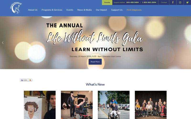
When I first volunteer at CPABC, I help with their graphic design and web updates. Little by little, we see that my tweaks lead to more interactions. One such tweak is reorganizing the navigation so that it makes sense to everyone, especially the staff.
As staff members use the site more and use social media to promote activities, we see a boost in online traffic. Because of this, CPABC decides to hire me to redesign their site to further promote their mission. The three main goals are:
- Create a consistent look and feel.
- Make the site easy to use on mobile and tablet.
- Promote programs, services, and social media more prominently.
Result
To make the most of our funds, we keep all the existing posts and content intact and only modify the overall design of the site. The new website:
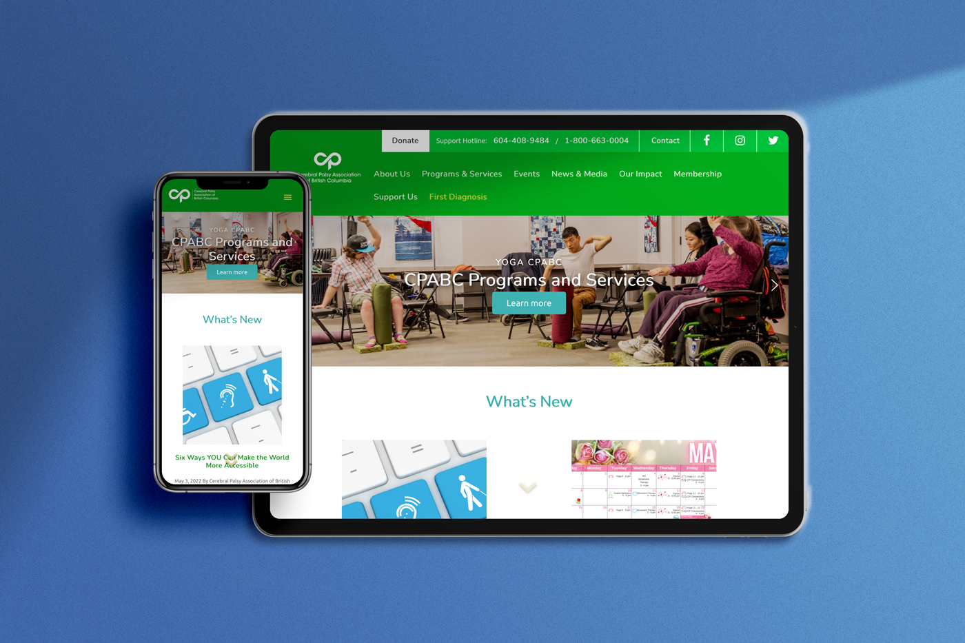
- is mobile friendly
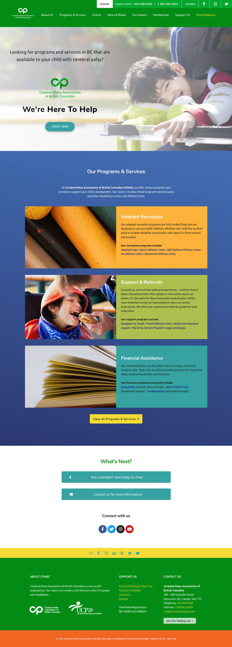
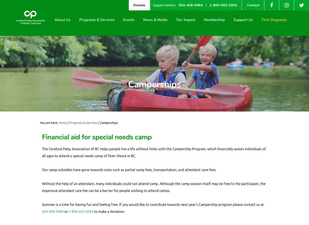
- uses descriptive images for programs, services, and financial resources
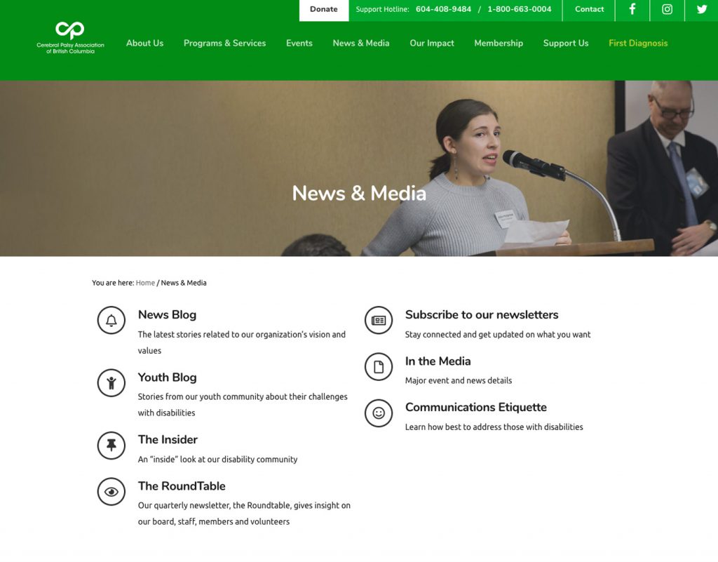
- has an expanded menu with subpages,
- promotes their email newsletter subscription
- features social media feeds on the home page
- has a consistent look and feel, with blue and green* being the main colours
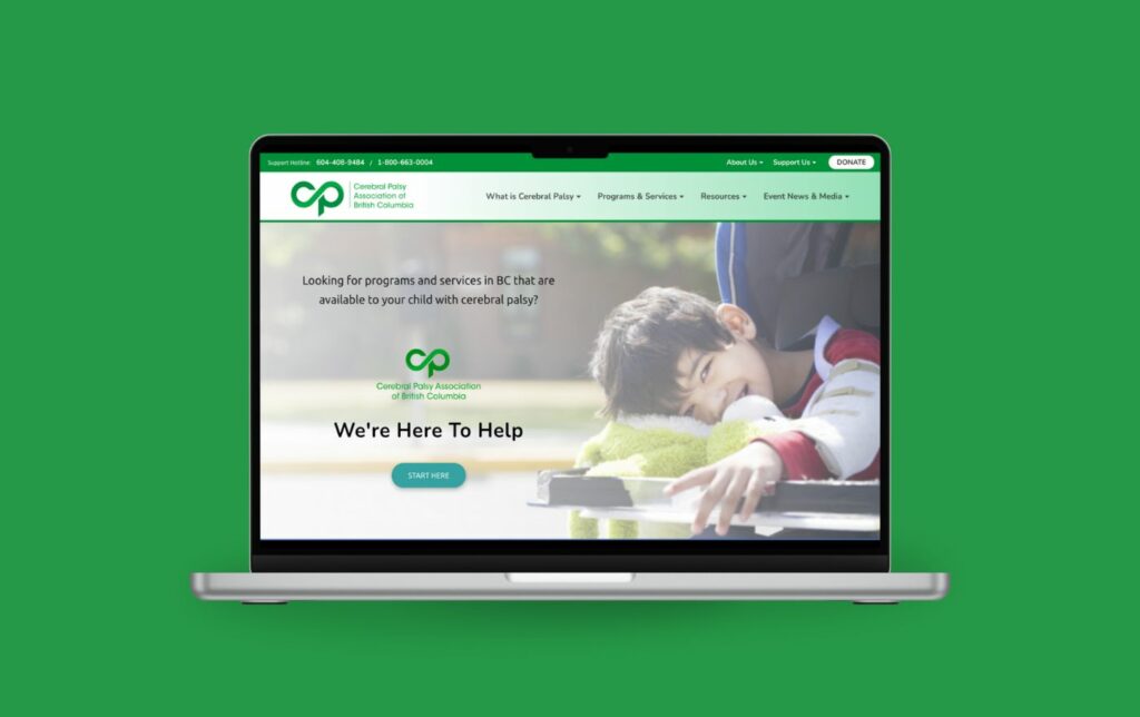
*In 2021, CPABC updated their logo and colours. Since the site design and structure were robust, they easily updated these without the need for a complete overhaul.
Resource website • Mega menu navigation • Membership form • Events calendar • Donation form integration • MailChimp email newsletter set up and integration • Campaign landing page design • Site maintenance
Ready to start?
Bring out the excitement. Let's discuss your vision!
